
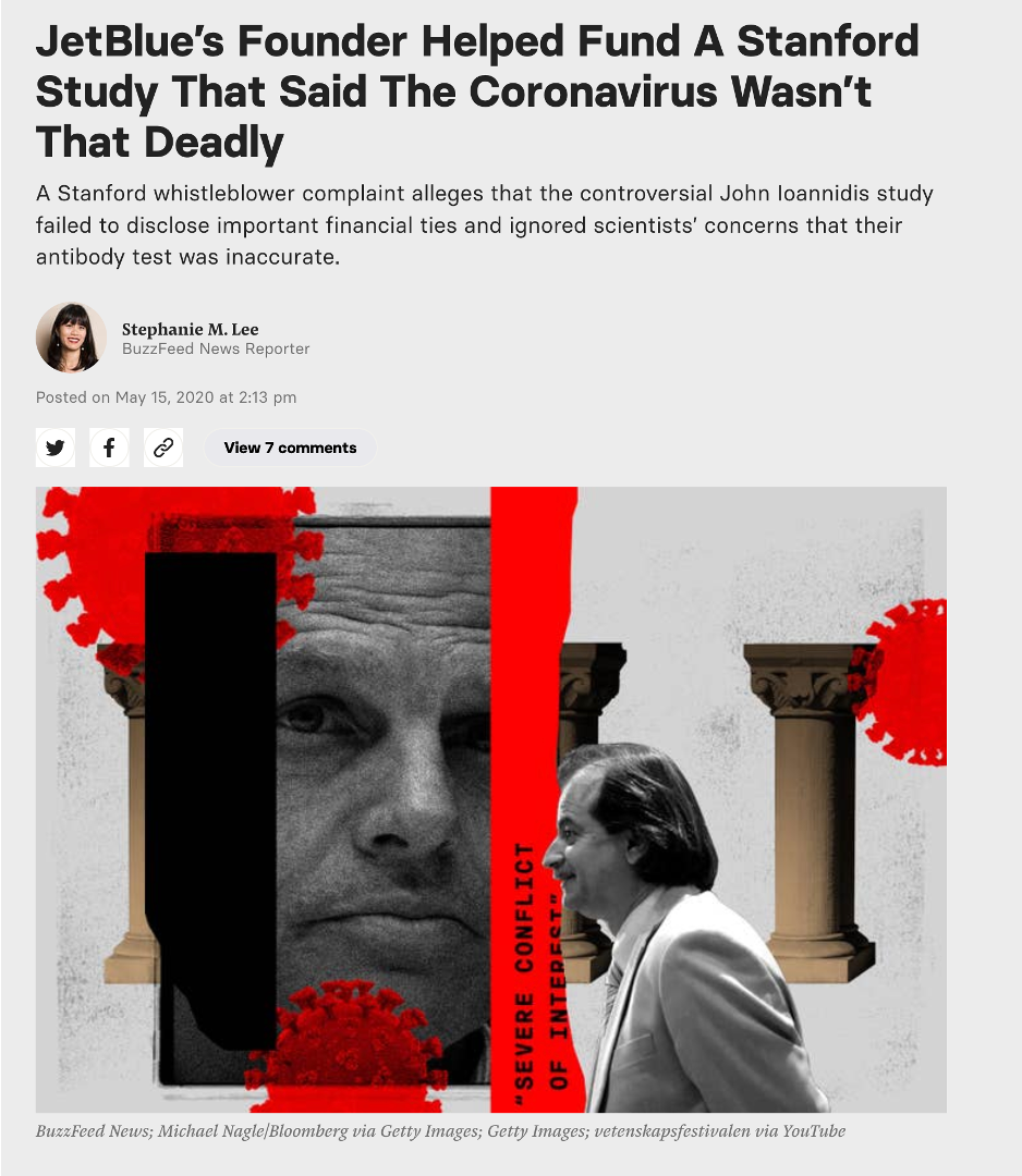
Why Jay Bhattacharya Does Not Belong Anywhere Near the NIH
This One Study Alone Should Disqualify Him

Note to readers: For ease of use, I have now combined what was previously two posts into one.
As Trump crashes the machinery of the world’s leading life sciences research infrastructure, flipping circuit breakers and pouring sand in the gears, it is critical to consider the expertise and character of those he has picked to restart it. In April of 2020, Jay Bhattacharya, his nominee to direct the National Institutes of Health, led what was among the most consequential studies of the entire pandemic. It was also one of the most deeply flawed and damaging to public health. Its key finding was an estimate of the rate at which people with COVID were dying. As demonstrated in detail at the end of this piece, that proved to be a wild underestimate, off by a factor of four to eight. The flaws began even before they collected the first sample.

Setting the Stage: The rise of COVID
When SARS CoV-2 first appeared in the closing days of 2019, it raised alarms among public health workers and epidemiologists. For 17 years, they had been haunted by SARS CoV-1, another corona virus that had spread globally, killing 10% of those infected with devastating lung infections. It took two years of stringent isolation and quarantine procedures to get the virus in check. As the pandemic took root, evidence suggested this new virus was less deadly than the original, but more contagious, making control much more challenging.

On March 3, 2020, WHO Director General, Tedros Ghebreyesus, declared that COVID had killed 3.4% of diagnosed cases based on 92,000 cases and 3,200 deaths worldwide. This was a staggering number, which, if applied to the US population, would translate into 11 million deaths. In the six weeks leading up to that announcement, the Chinese government had brought the disease to heel, but only by employee extreme public health controls, which many thought of as draconian, including locking down Wuhan, a city of 11 million people. The world had watched in horror as its streets emptied, then filled with public health workers wrapped in white, biosafety suits.
As an economist, Bhattacharya and his coauthors were doing a different mental math. The disease was present throughout the United States. A Wuhan scale shutdown of the US would have devastating economic consequences. What was needed was a serious national debate about the trade-off between the public health impacts of COVID and the economic impact of public health interventions. But conversations about how to weight death and disease against money are notoriously difficult. The evidence outlined below suggests that what we got instead of that debate was an effort to demonstrate that COVID was “no worse than the flu”, a risk that we confront annually with no non-pharmaceutical interventions at all.
The question here is not whether the study was wrong. As I will detail in the conclusion and as many others have shown, they underestimated the severity of COVID by a factor of five or more. They were wildly wrong. How did they go so far wrong and have so much influence? What warning signs did we have?
There were many.
Red Flag #1- Laying the Foundation for Confirmation Bias
The most common way to define the severity of a disease is its infection fatality rate (IFR), which is the percent of infected individuals who die. The case fatality rate that the WHO had provided was related, but not the same. Cases represent diagnosed infections. With tests in short supply (the initial US test didn’t even work) many people with infections were not being tested, particularly those who did not seek medical care. If we were underestimating the number of infections, and every serious epidemiologist knew we were, we were overestimating the IFR. (Ultimately, in 2024, a comprehensive analysis by a large international team of researchers concluded that the actual IFR for the United States in April of 2020 was closer to 1.3%.)

Bhattacharya and his colleagues argued that the IFR was probably closer to 0.2%. They made this assertion, not in front of the scientific community, which could identify its limitations, but in the mass media. Collectively, in the month prior to conducting the study, four of the study authors produced three separate opinion pieces, including two in the Wall Street Journal.
Once you have staked your reputation in the most public way possible on a position for which you have no direct evidence, your capacity to objectively gather and analyze data relevant to that position has been severely compromised. This alone should have disqualified this team from conducting the research described in this paper. Instead, within days of publishing the WSJ op-ed, Bhattacharya and his team had secured support for a study they presumed would prove their point and, in early April, as New York City was stacking bodies in refrigerator trucks, they began a study to demonstrate that we were overstating the risks of COVID.
John Ioannidis, author of one of those opinion pieces, once warned: “Scientists in a given field may be prejudiced purely because of their belief in a scientific theory or commitment to their own findings.” He and his coauthors seemed to believe they were immune to this bias.
The evidence suggests they were not.
Red Flag #2: Lack of Experience
Establishing the true infection rate in a population requires a serosurvey, which involves testing a random sample of the population for antibodies to the virus. These are deceptively difficult studies to perform well and require a skilled and experienced epidemiologist to conduct.
In addition to Bhattacharya, the core team of authors included Neraj Sood, another economist and author of one of the WSJ op-eds, and Andrew Brogan, a hedge fund manager. The lead author, Eran Bendavid, brought some relevant expertise as an infectious disease physicians, but he was not an epidemiologist. The lone epidemiologist on the team was John Ioannidis, who had built his reputation not by doing original epidemiology, but rather by reviewing, distilling, and critiquing the work of other epidemiologists. Even the best film critic cannot be counted on to make a great movie. Most critically, no one on the team had ever conducted a serosurvey.
Undaunted by this lack of experience, they rushed to assemble the necessary funding and resources. Just nine days after publishing their op-ed, they had assembled a team that was collecting blood at stations around Santa Clara county and testing it for antibodies to the COVID virus.
As the first serosurvey of COVID, they knew this would have enormous impact. As the evidence below attests, they just didn’t know how to do a serosurvey.
Red Flag #3: Dubious Tests
The accuracy of the test used to detect COVID antibodies in the blood of study subjects was particularly critical in a context in which they expected the prevalence of past COVID infections was 1-2%. In that context, a test that is 99% accurate can be completely misleading.
In addition to including no infectious disease epidemiologists, the team included no virologists, immunologists, or pathologists, of particular concern because there was no readily available test for COVID antibodies. To their credit, the authors recognized this limitation and reached out to other Stanford scientists, including a virologist and a pathologist, and asked them to evaluate the test they planned to use. However, when those scientists advised against using the test and said they didn’t want to be associated with the study, the authors and their supporters argued with them, pressured them, and even offered them funding if they would sign off on the test.
Ignoring the advice of laboratory experts that they had turned to for advice raises a huge red flag. When they moved from the lab to the field, the situation got worse.
Red Flag #4: Selection Bias
Getting a truly random sample of a population is never easy. Recruiting one for a serosurvey, when you need blood is almost impossible. There are tricks employed to ensure your blood samples are as close to random as possible and methods for assessing possible bias in the sample, but this team had no experience with them.
For a sample of the population to represent the true rate of undetected COVID infections, the authors needed to be sure that the people participating were not more likely to have infections than the people who did not participate. The investigators needed to ask themselves, Why would someone drive across Santa Clara County during a lockdown to have someone put a hole in their finger and take blood? I can come up with three possible explanations:
1. An altruistic desire to advance our scientific understanding of COVID.
2. A strange mix of curiosity and boredom.
3. They or a family member had experienced a significant respiratory illness and wanted to know if it had been COVID.

I would bet on door number three.
To understand why, we need to estimate the number of undiagnosed cases in Santa Clara County. As of the study date there had been 1351 diagnosed cases. The number that should be accurate is the number of COVID deaths. In the spring of 2020, the typical time to death was 10 days. Ten days after the study date, there had been 74 deaths. If we assume the true infection fatality rate was the WHO CFR of 3.4%, which Bhattacharya had said only reflected severe cases, there would have been over 825 severe undiagnosed infections. Just 6% of these cases would completely account for the 50 infections found by the study.
To make matters worse, they conducted half of their sampling on a Friday and Saturday, meaning they will oversample those who do not work on Fridays and make it almost impossible for those who work a six day week to participate. Furthermore, anyone who did participate among those for whom work hours posed a challenge would have likely had a strong motivation to participate.
One of the key ways to minimize selection bias is to maximize the participation rate. This is epidemiology 101. If you recruit a random sample to participate and they all participate, you have eliminated the possibility of selection bias. Every time you approach someone to participate and they refuse, the chance for selection bias increases. This is known as a non-response bias.
So, let’s see what they did to minimize the non-response rate.
Red Flag #5: Facebook and the low participation rate
To recruit subjects, the authors turned to a marketing team and the marketing team turned to Facebook. It is hard to imagine a worse way to ensure a high participation rate than a Facebook ad. In 2020, the average click rate for an ad was 3%. And most of those don’t follow through. In other words, their non-participation rate is likely to be AT LEAST 97%.
It is standard practice in an epidemiological study to report participation rates and Facebook provides detailed information on views and clicks. The authors, however, did not see fit to share that information with their readers, a hint that either this team didn’t understand selection bias or that they did and wanted to keep information on participation rate from their readers.

In the supplement to the published paper, they do acknowledge that they submitted 11,000 people clicked on the ad in the first 24 hours. They do not reveal the number of ad impressions, but a 3% click rate would suggest about 360,000 people viewed the ad. Of these, 4,174 registered and only 3,330 participated. The implied 99% non-response rate all but guarantees selection bias, especially when participation requires you drive across town and give blood. As noted above, a suspicion that they might be positive could be a strong motivator to participate either out curiosity or if they imagined there could be an advantage to knowing you had been exposed.
An email sent to potential participants laid this advantage out in detail.
Red Flag #6: Selection bias on steroids
Thanks to a whistleblower and the excellent investigative reporting of Stephanie Lee, we know that the Jay Bhattacharya’s wife took it upon herself to help encourage participation in the study. Her email to the listserv of their child’s middle school, encouraging parents to participate, advising them the test would give the “peace of mind” because, if the had had COVID, they would “no longer need to quarantine” and could “return to work without fear”.

Bhattacharya does not note this email in the initial preprint, makes a vague reference to it in a supplement to the revised preprint, and a somewhat more specific comments it in the supplement to the published paper and, when writing about it later, he suggested the only problem it induced was to oversample affluent people, which they adjusted for statistically. He goes on to throw his wife under the bus for not being a researcher and attack Stephanie Lee’s investigation as a hit piece.
In fact, that ZIP Code, with 1% of the county population contributed ~7% of the study population. This study, in other words, was a set up for selection bias. There are other tricks that epidemiologists use to assess and adjust for selection bias. How they dealt with (or didn’t deal with) selection bias takes us to our next red flags.
Red Flag #7 Not comparing non-participants to participants
One standard tool for evaluating selection bias is to collect information on non-response. This can be done by directly asking non-respondents their reason for participating. This is possible if potential participants are being contacted directly, but that is challenging if not impossible with a Facebook ad. Another approach would be to conduct a separate survey of the general population and ask them about recent illnesses or disease symptoms. If the frequency and severity of symptoms in the general population is the same as participants, we can have some confidence that a history of symptoms did not motivate participation. This was neither done nor considered in this study.

Red Flag #8 Not assessing motivation for participating.
The simplest way to address concerns as to participants’ reasons for participating is painfully obvious. Ask them. Why did you participate? Do you think you or someone you know might have had COVID? They did none of this.
They at least asked subjects about a list of symptoms over the past two weeks and over the past two months. What they found is that 82% of those who tested positive had experienced at least one of the symptoms on their list in the past two months. Those who had symptoms were more than twice as likely to test positive. And their symptom list was woefully inadequate.
Their list didn’t include muscle aches, fatigue, or headaches, which are three of the six most common COVID symptoms. So, we don’t even know if those with none of the listed symptoms actually had no symptoms. They also included no information on the severity or duration of symptoms. The closest they come to considering severity is to look at the prevalence of combined cough and fever, but only half of symptomatic COVID cases have a cough, so far fewer than half would be represented by that pairing. Even this weak tool provides evidence that the antibody prevalence was associated with severity of symptoms.

Despite all of this, they routinely refer to those testing positive as having few or no symptoms. In fact, the authors use this very limited analysis in a bizarre attempt to prove that self-selection bias was not a problem by analyzing this as if it captured all of symptom based participation despite the fact that they don’t consider three of the six most common COVID symptoms, don’t ask about severity or duration of symptoms, and don’t ask if symptoms motivated their participation.
It seems as if the only problems that concerned the authors were those that might reduce their estimate of COVID prevalence. At one point they even state, “we were concerned about the apparent over-representation of wealthy and healthy-appearing participants. This bias is consistent with a common type of healthy volunteer bias which leads to under-participation of sicker populations”. If you are looking for antibodies in asymptomatic people, why would you be concerned that they look healthy? If you cluster your sampling stations in affluent communities, why are you surprised that subjects appear wealthy?
The authors bias towards methods and procedures that lead towards elevated risk estimates becomes clear if we look at adjustments they made to the raw data. Or, in this next example, adjustments they didn’t make.
Red Flag #9 Not correcting for selection bias
Astonishingly, they do not attempt to correct for or assess the bias likely to have resulted from the e-mail sent by Bhattacharya’s wife. They don’t even acknowledge its existence in the initial preprint and bury it with vague references in the supplementary material for other versions, arguably deserving of its own red flag. Had they been determined to minimize bias, they would have simply excluded subjects from the relevant zip code. At a minimum, they should have compared antibody prevalence in this ZIP code to the larger population to determine if there was a self-selection bias. If they had assessed, they might have been able to do something about it. No effort. Penalty flag.

They do adjust for demographic factors such as race and sex, which remarkably increases antibody prevalence by 84%. This big a change in their results due to a reweighting algorithm should have raised concerns among the authors about the quality of their data. Instead, they treat it as further evidence of their thesis. This adjustment and its blind acceptance deserve a closer look and earns a red flag all its own.
Red Flag #10 Maladjustment
The raw data (with the above mentioned flaws) generates an estimated COVID prevalence of 1.5%. The authors then use a series of adjustments that, with a wave of a statistical magic wand, increase that estimate to 2.8%. Their description referring to “iterative proportional fitting”, “bootstrap procedures”, and “propagating uncertainty” makes the analysis seem very sophisticated. But all the description does is obscure what is happening.
If we simply look at the data in context, we can see why it raised their estimate of prevalence so dramatically. It suggests that either the authors don’t understand their data, or they don’t want us to understand their data.

These data make it clear that the authors do not have a random sample. The sample had twice as many whites, about half the Asians, and less than a third of the Hispanics as the population of Santa Clara County. Instead of asking why they have this extremely nonrandom selection, they presume to solve it by fitting, bootstrapping, and propagating. They don’t ask why the relative rate of COVID antibodies is so high in their Hispanic group when ethnicity does not appear to have had a strong relationship with COVID statewide.
Remember that only a tiny fraction of those given the opportunity to test did so. The authors don’t ever seem to seriously explore why they participated. They don’t consider the possibility that many in the Hispanic community worked at jobs that make it difficult to take off on a Friday, or even a Saturday, to get tested. They don’t acknowledge that their sampling locations were concentrated in one area of the county that might be closer to those wealthy white people they worried about. That could well mean that the few Hispanics that did participate had reason to be particularly curious about their COVID status. In other words, the high antibody prevalence and low participation rate among Hispanics might be evidence of a self-selection bias rather than an aberration. If so, their adjustment scheme simply amplified that bias.
The fancy statistics make it clear that the authors do not lack for intelligence. But that only makes the study worse, because it suggests they knew exactly what they were doing. The fact that the authors consistently ignore adjustments that might have decreased their estimate of the prevalence of COVID antibodies while including any adjustment that would increase it raises serious concerns about their intellectual honesty.
Red Flag #11 Conflict of Interest
It might seem from the accumulated red flags that Bhattacharya and his team didn’t look for weaknesses in their data, like they didn’t want to look. If so, why? The fact that they had declared their expected findings before collecting their first blood sample, raises the possibility that they were protecting their reputations. His co-author, John Ioannidis, has written about this bias. A second possible reason revealed itself even before the manuscript was released.
Just two days after the completion of sample collection, David Neeleman, CEO of Jet Blue, wrote an opinion piece in which he revealed the essence of the study’s findings and mentioned his regular discussions with the study’s authors. Despite this, the authors of the study never declare a conflict of interest and insist that Neeleman had no impact on their work even after it was revealed that Neeleman had provided $5,000 to support their research. He had even told them that Elon Musk would be interested in funding a much larger, national study. The fact that he was the first to publicly announce their work provides clear evidence that his role was anything but hands off.
Funding from one of the industries most severely affected by COVID travel restrictions represents a clear conflict of interest and raises a red flag. Hiding and denying that conflict earns a bonus flag.
Red Flag #12 Ignoring Critics
Many of the flaws mentioned here have been raised by others. Many of those criticisms were ignored, dismissed, or even ridiculed by the authors. Bhattacharya even went so far as to write a piece insisting that the Stanford faculty members who refused to support his research did so because they were trying to develop their own antibody test.
Even as COVID, the ultimate critic, proved their numbers to be wildly wrong (see below), they insisted they were right. None of the issues listed above was seriously addressed in the published paper when it was released a year later. Instead, Bhattacharya used the paper’s publication in a peer reviewed journal to dismiss critics.

The fact that they got it published with all these flaws is more an indictment of peer review than a measure of the paper’s quality. And perhaps the influence of Ioannidis, who was on the journal’s editorial board at the time it was published.
Red Flag #13 On the Media
Bhattacharya has suggested releasing the paper as a preprint was a routine choice, but use of preprints in medical research was anything but routine. Preprints were not new to science, but the preprint server for medical science, medrXiv.org, had only existed 10 months and Bhattacharya had never released a preprint before. Preprints are a great innovation, allowing for the immediate release of research results and providing a vital function during COVID, but their use in this case meant that there had been no opportunity to critique the study before its conclusions were shared with the world. And the authors did everything they could to make that happen. They appeared everyplace from CNN and Fox to YouTube. The hedge fund manager on the team penned an op-ed for the Wall Street Journal. Again and again they declared that COVID is no worse than the flu. The fact that they were wrong did not stop their assertion from permeating the COVID debate.

One other organization that picked up on their work was the American Institute for Economic Research (AIER), which published an extended piece lionizing John Ioannidis and welcoming his findings. In October, they brought Jay Bhattacharya together with two other academicians to create the infamous Great Barrington Declaration (GBD), which claimed that the mass infection of “not vulnerable” people, none of whom were vaccinated at the time, would lead to herd immunity and end the pandemic in 3-6 months. The next four months saw the worst spike in COVID deaths of the entire pandemic.
Were they right?
Viruses have little patience for bad science. If the infection fatality rate (IFR) were 0.17%, as they asserted, infecting everyone in the US with no protection from the vaccine would result in a maximum of 521,000 COVID deaths in the United States. We passed that number on March 1, 2021, before the paper was even published on our way to the current death toll of 1.2 million.
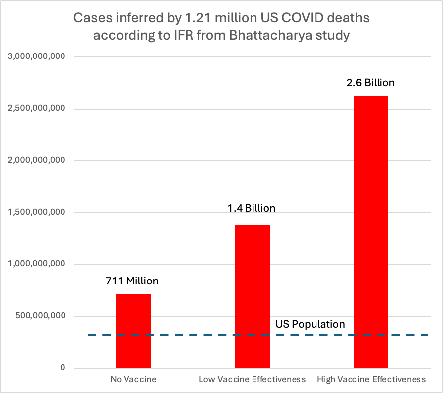
Without the vaccine, at their estimated IFR of 0.17%, 1.2 million deaths would imply to 711 million cases, which is a lot for a country of 330 million. But available estimates suggest we would have had two to three times the observed number of deaths without the vaccine, suggesting Bhattacharya’s estimate of IFR would imply between 1.3 and 2.2 billion infection in the US, suggesting a 4 to 8-fold error in their estimate
Bottom Line
They were wrong. The reasons lie in their 13+ red flags. We all make mistakes, but 13 is a lot and raises serious concerns about his suitability to lead NIH. More concerning is the question of character and integrity. His continued insistence that he is correct in the face of overwhelming evidence to the contrary, coupled with his repeated failure to acknowledge conflicts of interest has had a devastating impact on public health and disqualifies him as a researcher, much less a leader of research.

In the through-the-looking-glass world of Trump politics, none of this matters. He will be confirmed by a dutiful Senate. But I, for one, want to go on the record by unequivocally stating that Jay Bhattacharya belongs nowhere near the NIH.

Yes I remember that one so well. I had nothing better to do so I ran my own crack Bayesian analysis at home and found not only was their estimate way off (by many X) compared to the expectation value but the spread in the posterior distribution was enormous. But of course the right wing mediasphere absolutely ran with it.
Surely testing for antibodies requires that the patient has been infected for at least 7 days and is unwell? It doesn’t catch people who are infected with mild symptoms as there’s no requirement for a significant numbers of antibodies as the innate immune system is handling the infection. Which means that antibody numbers will reduce once the infection is cleared.